Background
Working as the UX designer in a team of one at HHAeXchange I’m responsible for all things UX, CSS and HTML. One of the main projects is an epic updating the communications module across three applications. Until now there is no way of telling what message that another user has replied to. Also the UI is very dated and urgently needs modernised.
Problem
Over the years HHAeXchange have developed various platforms/products that have commonalities but for different markets. Due to confidentiality reasons I can’t elaborate any further. Each of the platforms have been built by different teams with no direction interns of UI or UX.
Some user can have access to various platforms and due to lack of direction the experience can be different.
Goal
As a user I want to send and receive member/non-member messages to and from other agencies across multiple platforms.
Research
Research and that was conducted for this project is listed below:
- User interviews
- User Observation (Screen Shares)
- Current Platform Audit
- UX Benchmarking (Competitive analysis)
- Stakeholder interviews
- Data – queries ran on production database for metrics
- Affinity Mapping
- Expectation Testing
- User Testing
- A/B Testing
Discovery
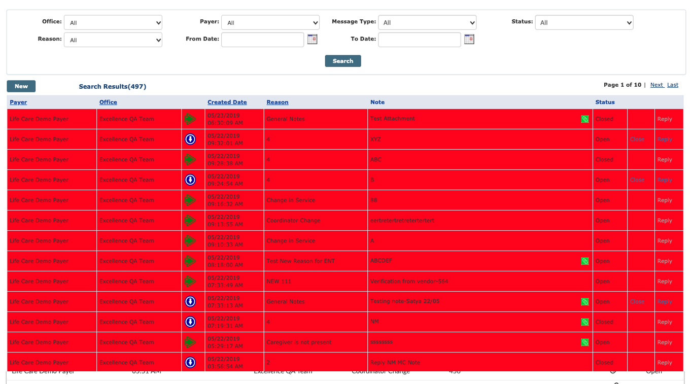
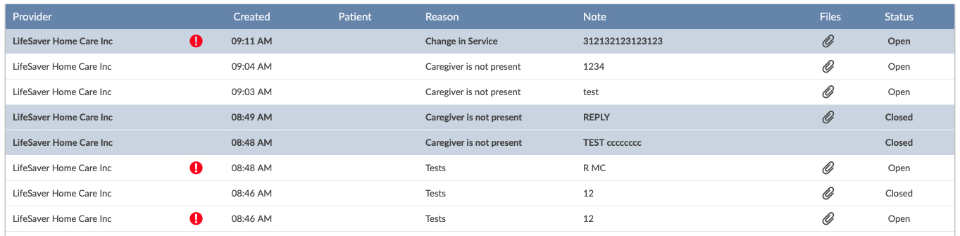
After many many Steakholder and Product Owner interviews, as there were a lot of inconsistencies resulting in many pain points, I decided that an overhaul of the current system was the only way forward. FYI red indicates Urgent, seems every message is Urgent.
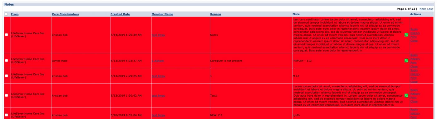
It was decided that we would modernise the UI and the UX considerably. In terms of UX the most obvious improvement would be adding the well grounded conventions of email systems. Bizarrely, there was now way to tell what the original sent message was hat you have received a reply to!!
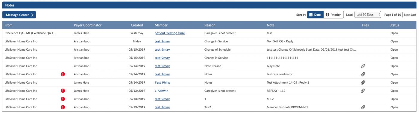
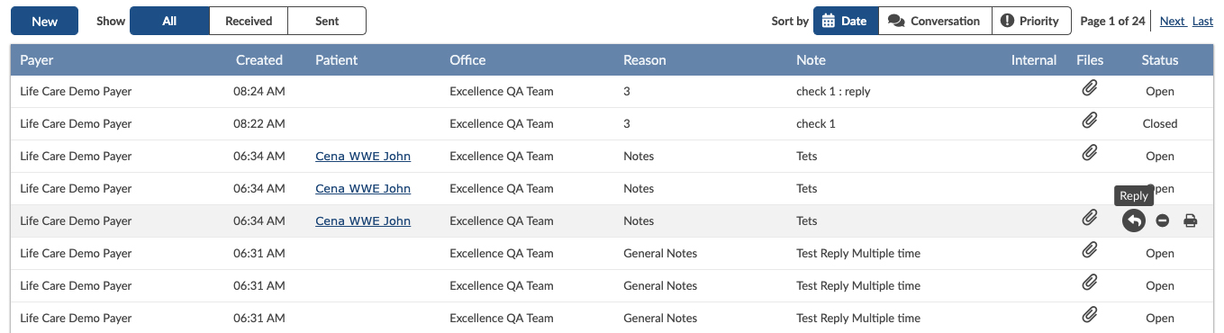
Message Center
The inappropriately named Message Centre only showed non-member messages. This will also be redeveloped to show both member and non-member messages. Before the row containing the message was allowed to increase in height depending on the content of note, see image above. This resulted in an untidy interface. Moving forward the note preview text will be truncated and fully displayed in the message detailed view.
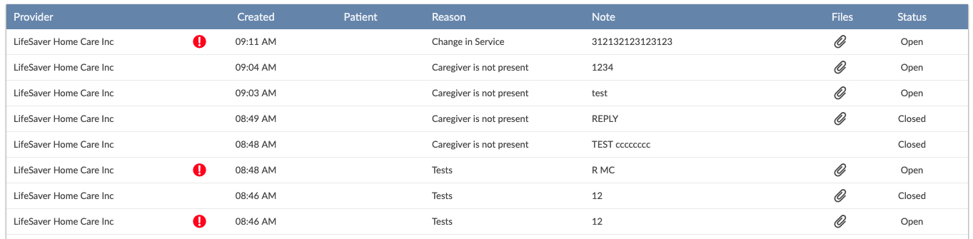
Legacy UI
Updated UI
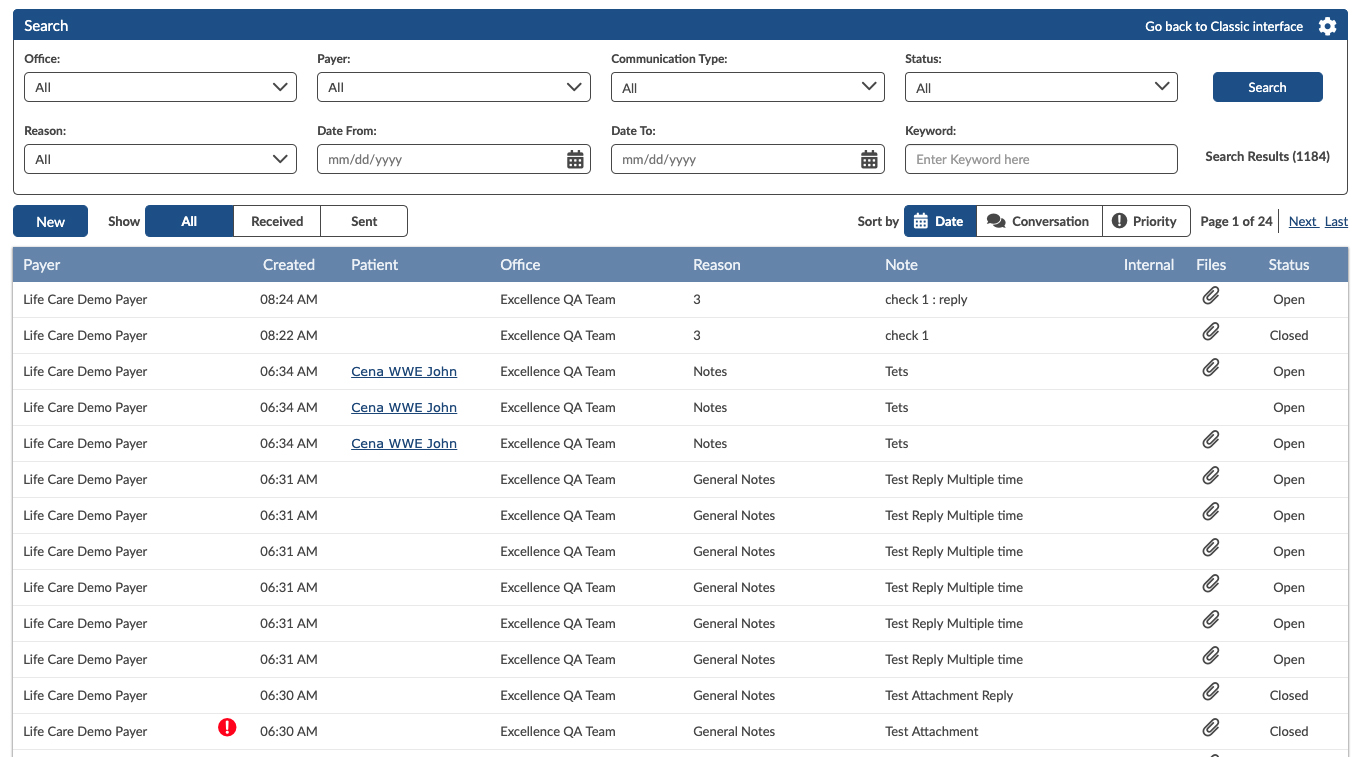
In the legacy environment the call to actions per row were also inconstant, for example on one platform: Reply, Close & Print, on another Close had been changed to Resolve. The taxonomy was unified across all platforms in all areas where inconsistencies occurred. The call-to-actions have also been integrated into the newly added hover interactions, again mimicking email interface conventions.
User Testing - Feedback - iteration
Read/Unread styling has been included initially, but on release and after some user testing we found that read/unread works perfectly on a personal basis, as in my email. But, the message centre is for messages sent to that particular agency, that has multiple users, it was acknowledged that if one user read the message others could potentially ignore it, thinking that the actions if any were completed or in process.
Unread Message Styling
No Unread Styling
In Summary
This project had a considerable amount of scope creep, which, could have been avoided through better requirements. As this was my first major epic with a new company, I had a steep learning curve in terms of pushing back on features that weren’t declared as part of the initial project.
The company, new to UX and are beginning to embrace the benefits of this skill set after some initial scepticism from some steakholders. This was also my first time experience working with a team spread across different continents and timezones.